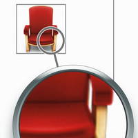
Fun facts about Mac OS X Leopard's icons


Leopard supports 512-by-512-pixel icons, which are much larger than the previous 128-x-128 standard. However, in its Human Interface Guidelines, Apple suggests that developers need to make fresh versions of the icons and not just blow up their old images.
For example, the 512 x 512 pixel version of the icon should not have thick strokes or look “vectorized.“ In general, the larger icon should be a higher quality rendition of the 128 x 128 pixel resource, which exhibits richer texture, more details, and greater realism.
I didn't realize that the Cover Flow view in the Finder also comes with its own share of issues for icons. The icons are set in a black background above a reflective "surface." Depending on the color of the icon or level of transparency, the icon can melt into the background or be clipped.
If your icon is very dark or has black edges, consider adding a slight inner glow just inside the edges to make the icon stand out against the black background. If you don’t add a glow to make the edges of your icon prominent, it might appear to dissolve into the black background of the Cover Flow view.
For the best-looking icons, developers must create versions of program icons from 512 x 512 down to 16 x 16 pixels. The original 128K Mac interface used 32 x 32 pixels.
Of course, the Aqua interface can provide photographic detail to these small illustrations. Apple suggests that developers add shadows to the icons, giving the idea that the icon is resting on a surface.
Icons that represent actual objects should look as though they are made of real materials. Examine various objects to study the characteristics of plastic, glass, paper, and metal. Your icon will look more realistic if you successfully convey the item’s weight and feel, as well as its appearance.
Looking through the Interface Guidelines, I was surprised to find a section on the conceptual viewing angle for icons. Some icons should be designed as if the viewer is looking at them straight on and others from an angle.
The angles and shadows used for depicting various kinds of icons are intended to reflect how the objects would appear in reality. All interface elements have a common light source from directly above. The various perspectives are achieved by changing the position of an imaginary camera capturing the icon.
Application icons look like they are sitting on a desk in front of you.
Utility icons are depicted as if they were on a shelf in front of you. Flat objects appear as if there were a wall behind them with an appropriate shadow behind the object.
Marcin Wichary offers a very entertaining resource called the Graphical User Interface Gallery. It has many different interface elements from many OSes from the past and present, including Mac, Windows and Gnome and BeOS. It also traces standard file type icons, sounds, splash screens.
It's clear from the icon grids on Wichary's site that for the most part, Mac icons have always looked better than Windows icons, whatever the generation.
One exception is the generic hard disk icon used in Mac OS 7.5; I admit that even Windows 3.0's version was better.
However, I find it interesting that the Mac OS X icon for a hard disk is a bare HDD mechanism, while Windows appears to show an external drive. Given how crazy some external drives can look nowadays, the relationship between the icon in the interface and its physical counterpart may be problematic. Or even that the drive is external, after all. Apple seems to hope (expect) that most users will know what a hard disk looks like.
A number of comments complained about the icon. John Knoll, the author of Adobe Photoshop, and the maker of the original icon, responded.
It was intended as a 1 hour photo booth, similar to a Fotomat booth, which were a very common sight in the late 80’s when we were first developing Photoshop. It’s meant to be a person manning the booth and a cash register inside the booth. At that time, application icons were 32×32 pixels, 1 bit per pixel. The “128? is the resource ID number. That image is a screen snapshot from ResEdit, the common resourse editor at the time. Whether you like it or not, it’s much more representative of a “photo shop” than the eyeball icon that Adobe finally chose.
In the classic Mac architecture, programs had a "resource" fork that held all kinds of GUI settings. The Finder used this information to let it understand what program a file belonged to without needing its file name extension. For longtime Mac users, the change to file extensions in Mac OS X was a step backwards; understandable and more compatible with the rest of the computing world, but still backwards. The tool to change resources in the days was called ResEdit.